Poolday.ai
Role:
Product Designer
Team:
Oliver Nicolini, SWE
Damien Benloukil, SWE
Kamil Debbagh, PM
Timeline + Status
Mid-February 2024 - Present
Launched and Relaunched :)
OVERVIEW
Revolutionizing Ad Creation
Amid the boom of generative AI Poolday aims to provide a platform for gaming companies to automatically generate batches of short form ad content to post on social media platforms for their gaming apps.
I was the sole designer working alongside PMs and engineers to develop the platform from infancy, riding the wave of vertical pivots, redesign efforts, roadmap switches, and the startup’s mentality of shipping fast.
HIGHLIGHTS
Create Your Ads in Minutes


RESEARCH
Understanding Our User
Who They Are
Marketing managers without video editing skills
What They Do
Create and maintain 10+ gaming apps
Their Problem
Creating ads is costly and time consuming as actors, video editors, and script writers have to be coordinated
DESIGN REVIEW
The Old Design Had Lots of Opportunities for Improvement ... and a surprise

1
Poor information architecture and coloring in menu bar.
The menu contains a mix of site pages and buttons to launch major actions. Selected menu items are colored the same as CTA’s diluting their significance.
2
Poor use of spacing and size in title area.
The title is excessively large considering that the main focus of the page are the videos. Lots of spacing is used around the CTA and title, eating up space that could be used to show more video cards.
3
Illogical use of tabs
These tabs don’t make sense. Each original has their own set of variations so showing all variations on 1 screen doesn’t make sense.
!!!
Surprise - no components in the design file

Components weren’t used and some icons were images - not svg’s! Talk about a nightmare!

GOAL
Launching a Redesign
Sometimes stepping back
is really stepping forward
Our engineering team already had lots on their plate but we decided a redesign was worth it. Why?
desire to speed up development by using shadcn - a front end library thats lightweight and maturity in design
we wanted a sleek modern feel to reinforce the message of being a cutting edge AI company
our target audience had pivoted from small mobile app start ups to multi-app gaming companies calling for changes in design to ensure usability
a redesign would allow us to capitalize on areas for improvement in our prior version
But don’t forget the pile of constraints!
Tight timeline
We had 4 weeks until relaunch to both redesign and rebuild the platform.
Limited engineering capacity
We had 2 engineers for the entire product and they were still laying the foundations of the platform
Reliance on Gen AI
Use of third party Gen AI APIs meant long loading times and limitations on what could be presented to users.
DELIVERY AND REASONING
Empathetic and Research Based Design
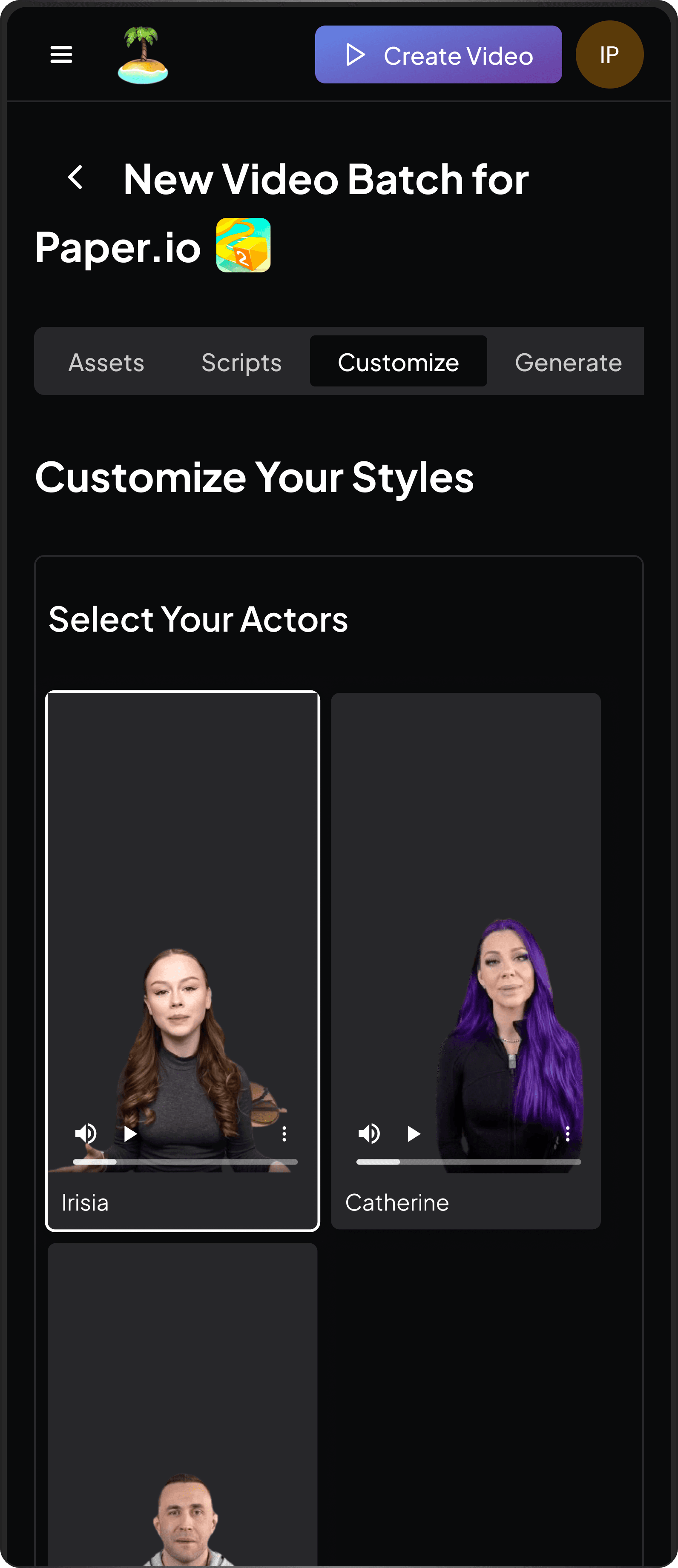
Improving Information Architecture
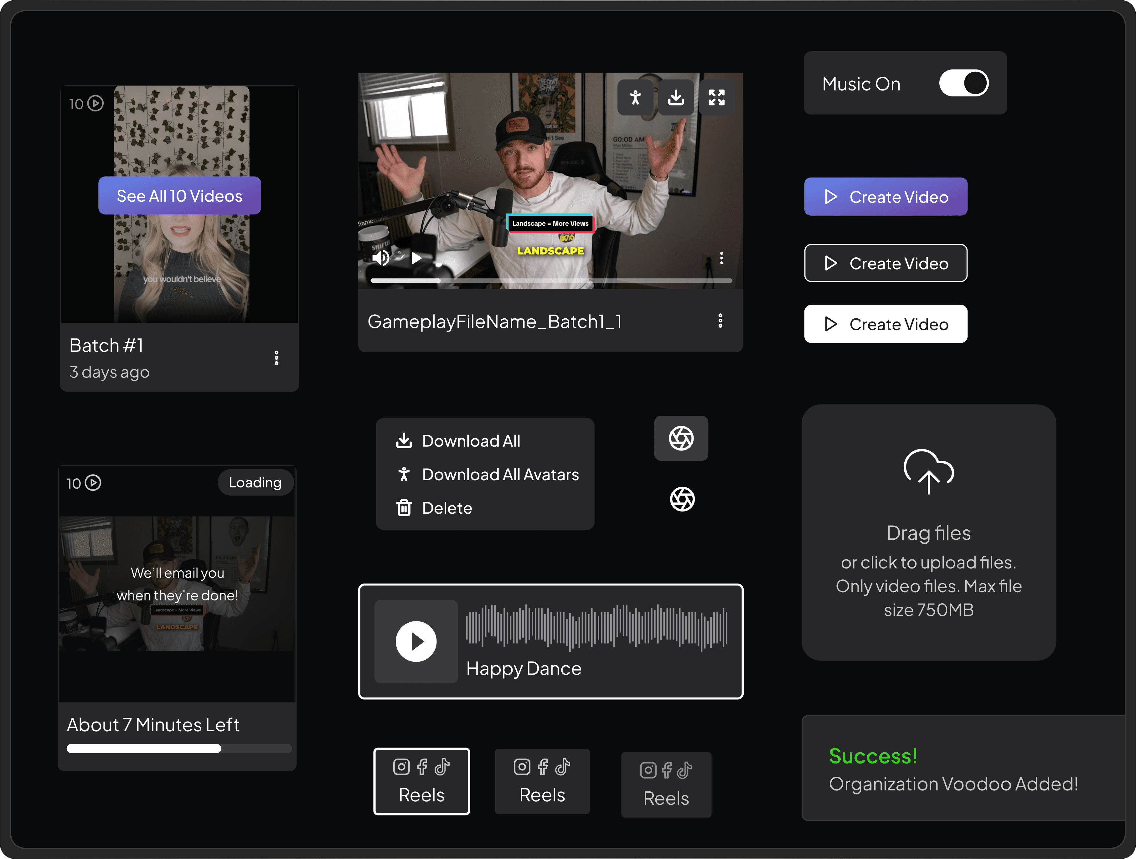
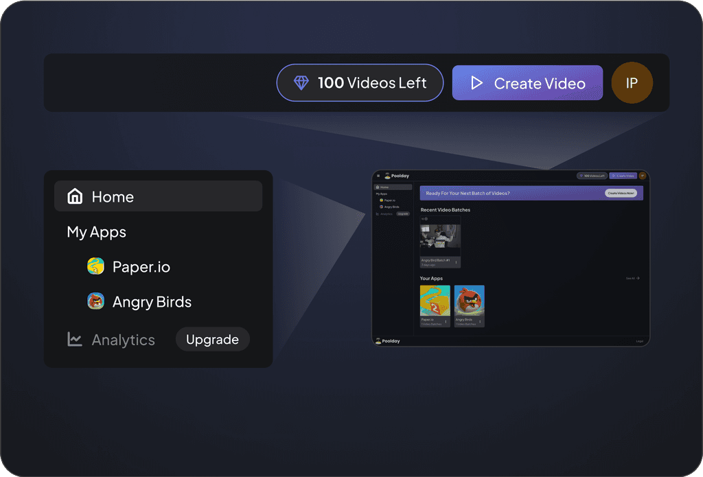
Given that most of our users have 10+ apps, navigation to apps was added to menu. The “Create Video” button was moved to the header to keep this crucial action in one consistent place and outside of the side menu which features locations.
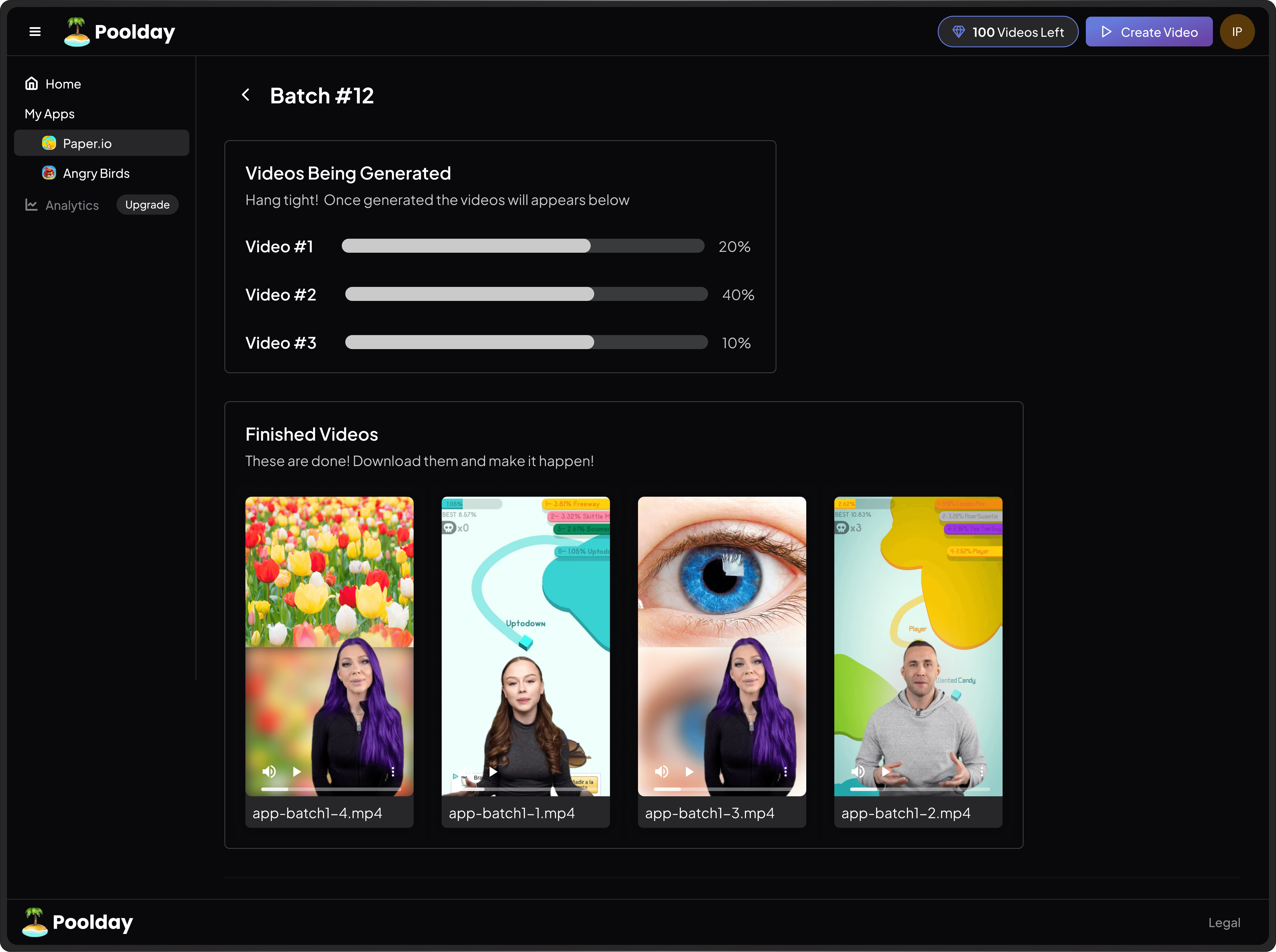
A single video? Or multiple?
User testing illuminated the fact that users didn’t always know there were more videos behind a batch card. To address this:
Number of videos is displayed in the top left corner
Batch cards don’t have a playable preview. While this may be valuable to customers I chose to prioritize directing users to open the batch by showing a button on hover

You can leave! I promise!
Originally, upon completion of the video creation process, users were brought to a detailed loading screen. However users during interviews noted that they were afraid of the process stopping if they left the page. To eliminate this, I chose to direct them to the home screen, show the video batch in its loading state, explicitly tell the users they could leave, and only show the detailed loading screen upon click.

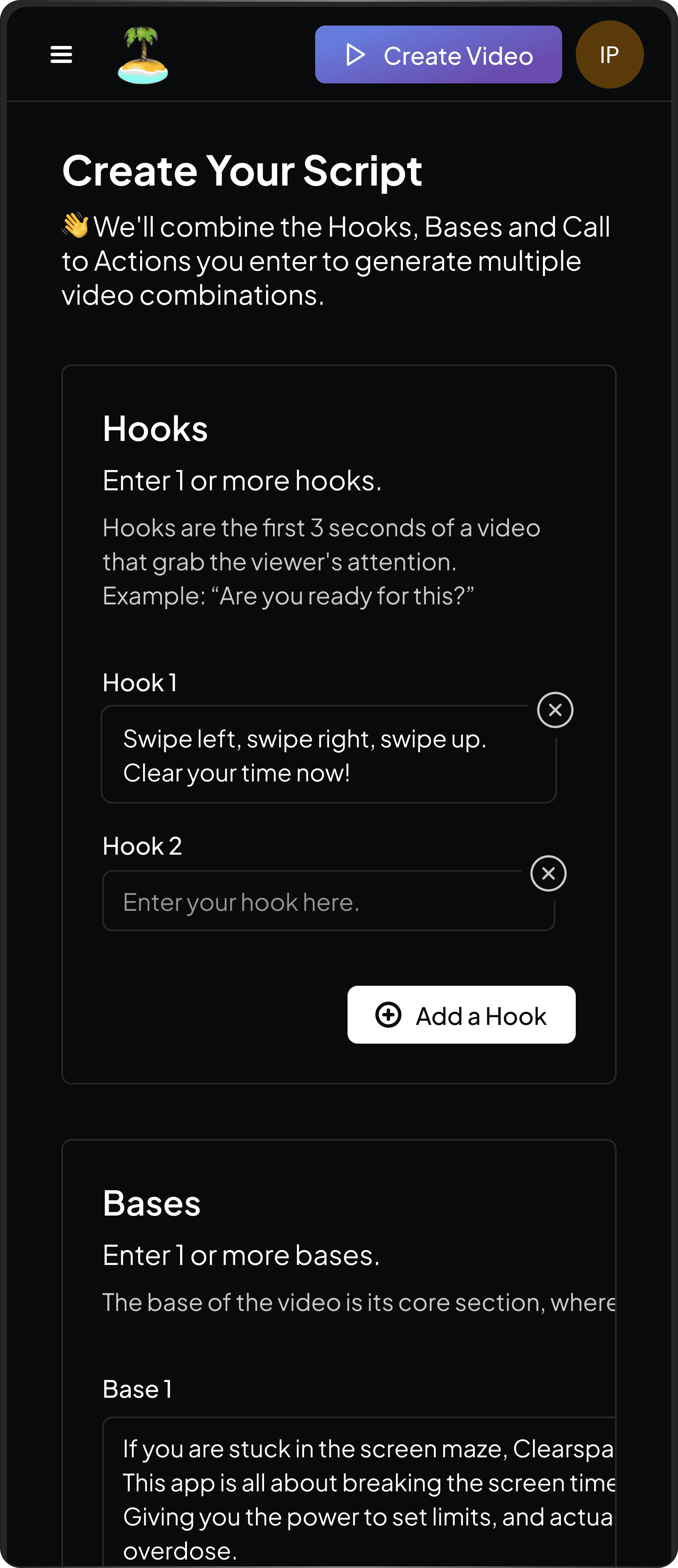
Balancing flexibility and simplicity
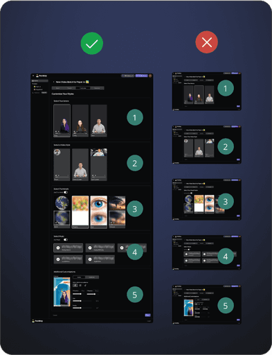
Selection of video elements were placed on one screen instead of separate pages. While splitting each selection onto its own step could make the experience less overwhelming as there would be only one decision per page, this design allows users to easily change their mind as they explore the various options. I chose to optimize for flexibility for the user here.
Loading with Limitations
Knowing that AI is non-deterministic in its generation which inherently gives it variable loading time, I reached out to our engineers to understand the loading information available. Instead of settling for a loader which shows no indication of progress, we defined a few trackable steps in the generation process. While the percentage is not completely accurate user, it still suffices to reassure our users that progress is being made.

LEARNINGS
Go with the flow
The start up world moves quickly. One week the targeted user base may change.
Another week we’re switching front end libraries an doing a complete redesign. Features I designed for are out the window. I learned to just roll with the bumps and not get too emotionally engrossed.
Be scrappy
Research insights are gold but getting permission to talk to customers was a challenge. I found that asking for non-customer contacts who fit our user persona, whether they be coworkers or acquaintances was an invaluable work around.
Consider Implementation
In helping the team create product roadmaps I found it very fruitful to leverage my past experience as an engineer and bring up obvious technical blockers. This prevented me and the company from wasting valuable time.
