Redesigning the experience of spreading Japanese inspired art workshops.
role:
Research
Prototyping
UI Design
square space design
team:
Ryley Galoucher - Owner
Irene Pham
tools:
figma
squarespace


CONTEXT
Problem
Current website is visually overwhelming and unorganized and fails to effectively communicate workshop offerings to its target audience: workshop attendees and corporate event planners.
Goal
Redesign the square space site so that offerings are clear and engagement increases.

DISCOVER
How do users percieve the current site?
4 Interviews
30 minute zoom call
DEFINE
Key Insights
Poor Aesthetics
Busy Navigation Bar
The navigation bar needs fewer options and better organization and is visually unappealing.
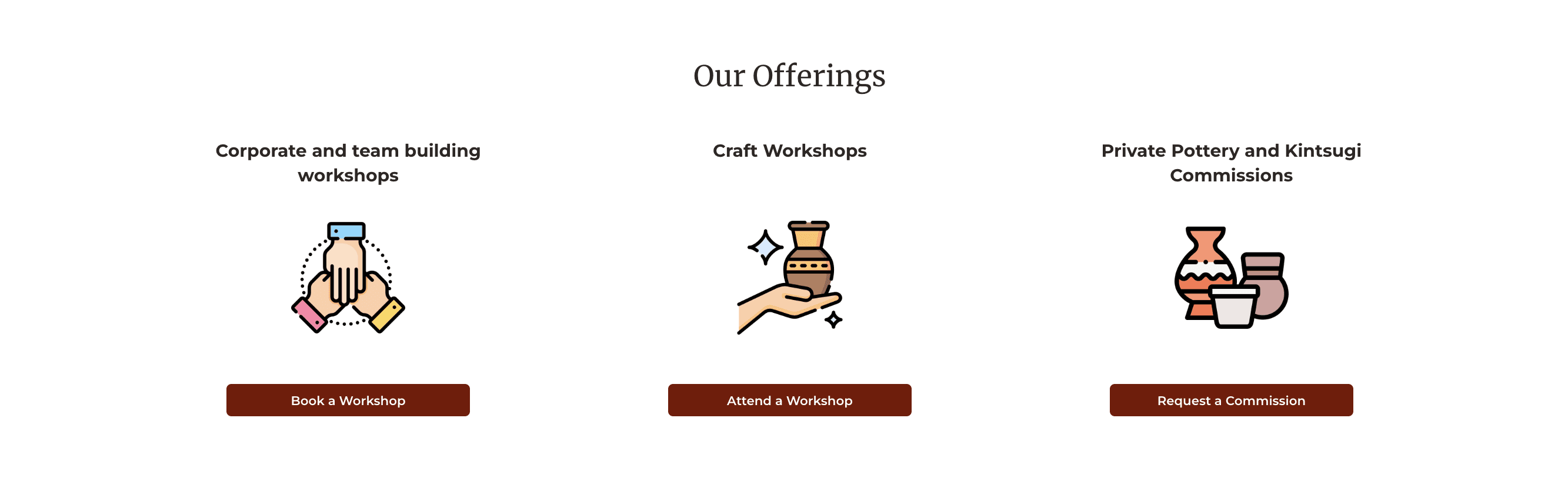
Offerings are unclear
Viewers are unsure of what is being offered.
DELIVER
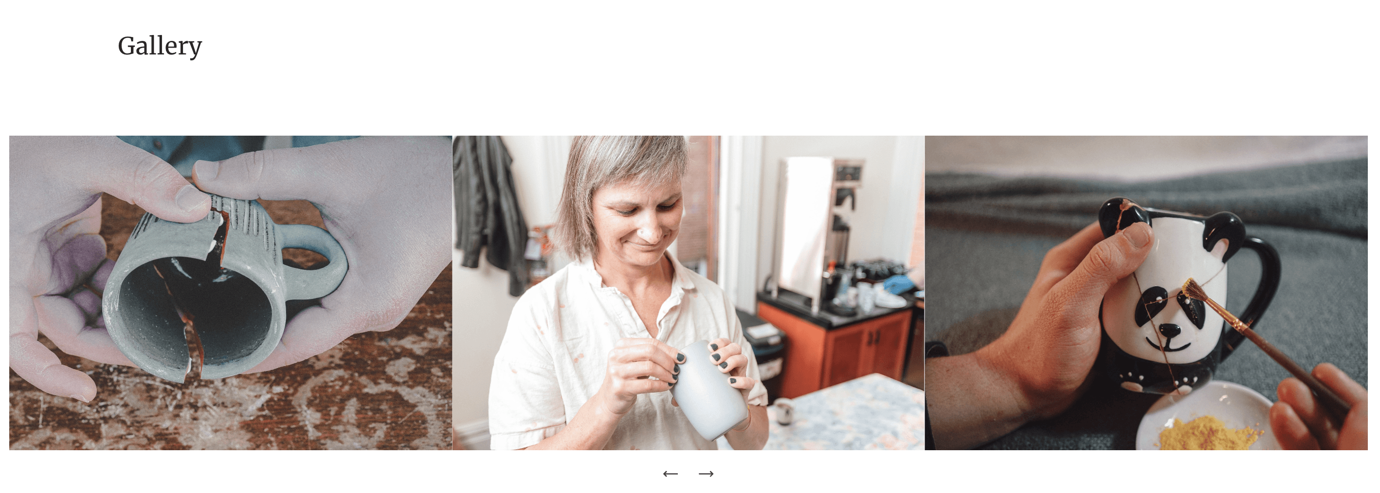
Increasing Awareness of Offerings
A slide show and section about the various Kintsugi offerings was added to increase understanding of the product.
Reducing Information Overload
Customer reviews were put into a slideshow format to reduce the amount of information overload on the page.
Before
After

Restructuring the Navigation Bar
The navigation bar was simplified and its formatting was altered to be more aesthetically pleasing.
Before

After

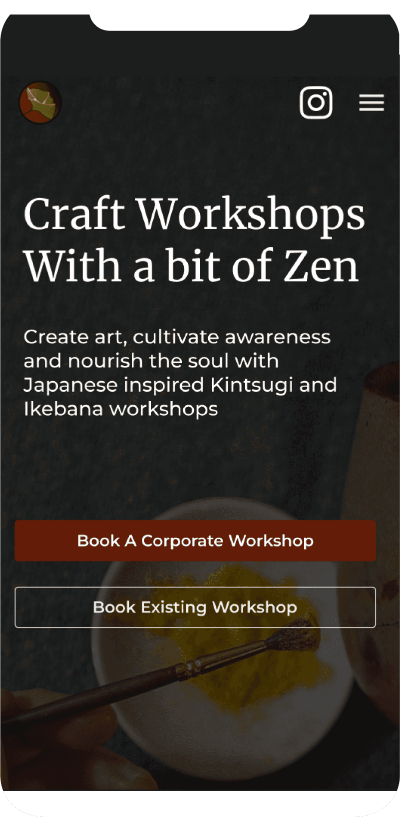
Informative and Aesthetic Landing Page
The hero section was made more aesthetically pleasing by increasing contrast between the background image and text. A more informative heading was used to educate the viewer about workshop offerings.
Before

After
